Branding and layout
Set logo, colors, policy links, and one- or three-page checkout flow.
Updated July 17, 2026On this page
- An existing checkout
- A PNG, JPEG, or WebP logo when using a custom image
- Published policy URLs if you do not want to use Shopify defaults
Branding belongs to the checkout, not the store. The customer-facing title and favicon are derived from the linked Shopify store, while each checkout controls its logo, accent color, layout, and policy links.
Configure the checkout identity
Choose a logo source
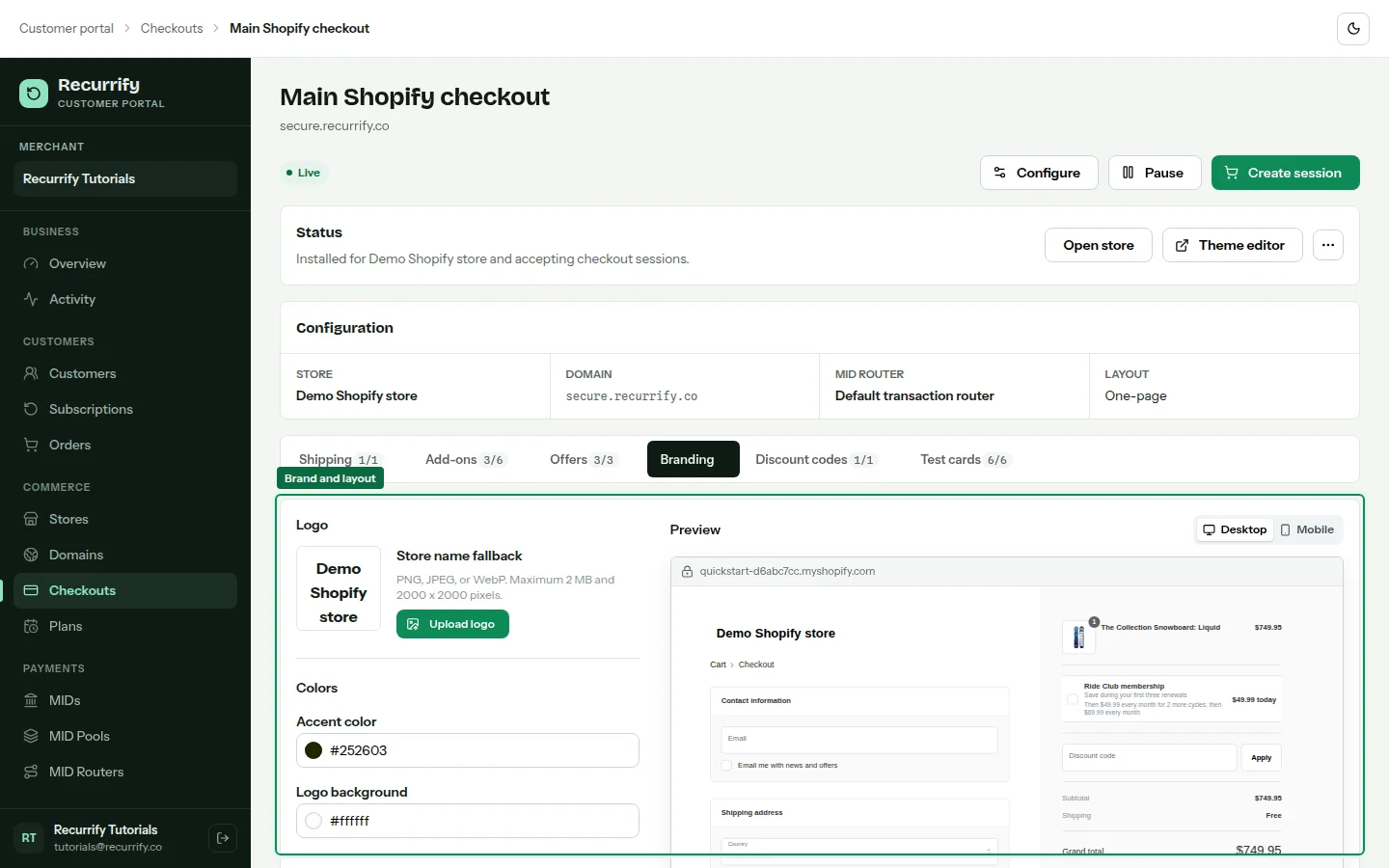
Open the checkout and select Branding. Use the Shopify logo when available, upload a custom logo, or fall back to the store name as text. Uploaded images are validated and stored as checkout-owned assets.
Set the accent color
Choose the checkout accent. Buttons, links, focused fields, radio controls, and checkboxes use the same accent so the preview matches the actual checkout behavior.
Choose one-page or three-page layout
One page keeps contact, delivery, shipping, and payment together. Three page follows Information, Shipping, and Payment steps similar to Shopify's native flow.
Review policy links
Set Terms of service, Privacy policy, Refund policy, and Shipping policy links. These appear in the checkout footer. Shopify policy defaults can be used where the store exposes them.
Branding ownership
| Element | Owner |
|---|---|
| Browser title and favicon | Linked Shopify store identity |
| Checkout logo | Checkout |
| Accent color | Checkout |
| One- or three-page layout | Checkout |
| Terms and policy links | Checkout, optionally sourced from Shopify defaults |